Презентація на тему:
"Apple logo"
Завантажити презентацію


 Depic...")


"Apple logo"
Завантажити презентаціюПрезентація по слайдам:

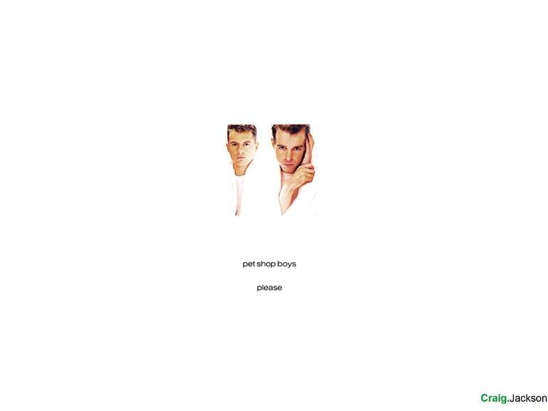
Apple Inc. Less is more Prof. Craig Jackson Head of Psychology Division BCU craig.jackson@bcu.ac.uk health.bcu.ac.uk/craigjackson

Blah Blah

It was back in the seventies Counter-culture meets Business-culture

Inspires passionate argument Strong feelings both FOR and AGAINST apple principles Mac design principles “Magic Cap” Metaphor

Visual Metaphor


Historical significance of the apple Greek Mythology Atalanta – daughter of Hades. Melanion won her hand in a footrace – used three golden apples to cheat. Eris (strife and discord) gave Zeus golden apple to give to the fairest woman. Apple of Discord. Nymphs guarding the tree bearing golden apples given to Hera when she married Zeus

Biblical significance of the apple Book of Genesis Forbidden fruit (although the apple is not named) Renaissance painters took liberties Knowledge Immortality Temptation The fall of man Sin itself Latin ambiguity – Malum Adam’s Apple

Germanic & Norse Paganism Idunn provides apples to the gods Eternal youthfulness Nehalennia Norse goddess sometimes pictured with apples Similar Irish parallels Skald (Norse poets) Thorbion Brunarson “Food of the dead”

Emotional Responses to seeing the logo Positives Negatives Jealousy California “It’s not Microsoft” Greed Envy Temptation Mac Users

Symmetry and Almost-Symmetry Best logos not quite symmetrical One small deviation from perfect

Psychology behind a great logo Know the company Know your design strengths Logo should be demonstrative Lines, shapes and form Avoid cliché Simple yet memorable Use clever visual devices Use vector software Get objective opinion Try it in different formats

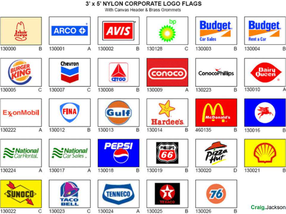
Some other brands

Some other brands

Some other brands

Some other brands

Some other brands
 Depic...")
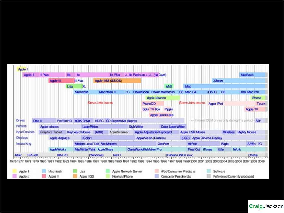
First Logo Designed in 1976 by Ronald Wayne (third co-founder of Apple) Depicts Isaac Newton sitting under a tree Apple dangling above his head Outside border reads, “Newton… A Mind Forever Voyaging Through Strange Seas of Thought ...Alone.” Wordsworth

Second Logo 1976-1998 Designer Rob Janoff came up with something more modern Janoff’s eventual design would go on to become one of the most iconic and recognizable corporate logos in history The “bite” in the logo was to help people identify it as an apple, and not a tomato or cherry (bite/byte) 22 years is a record “The symbol of lust and knowledge, bitten into, all crossed with the colours of the rainbow in the wrong order. You couldn’t dream a more appropriate logo: lust, knowledge, hope and anarchy.” Jean-Louis Gassée, former Apple CEO

Rob Janoff Created apple logo Art director at advertising and public relations firm Regis McKenna Designed it with a bite for scale, so people get that it was an apple not a cherry Also it was kind of iconic about taking a bite out of an apple. Something that everyone can experience.

Accessibility

Gay Rights Movement

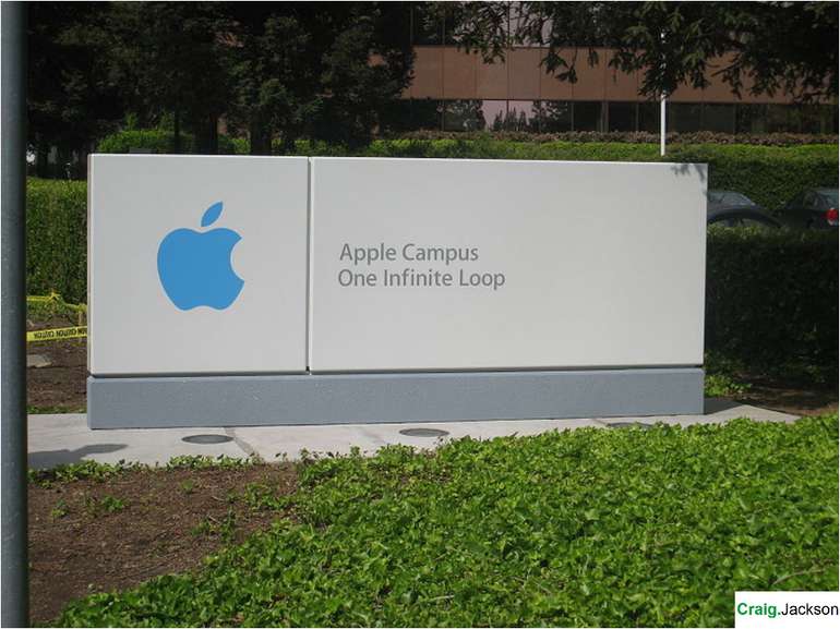
Monochrome Logo 1998-present Jobs returned to Apple in 1997 Tinkering with one of the most recognizable logos in the world wasn’t done simply because Steve Jobs is always looking to change things up. Experimenting with larger logos to make it more prominent. If the shape of the Apple logo was universally recognizable, why not put it where people could see it?

Chrome Overhaul Classic logo becomes metallic Old logo looke dout of place on monochrome kit Akin to work by Hajime Sorayama Airbrushed metallic erotic portrayals of females Sexy Robot 1983 Fetishism? Seduction link?

The Turing Myth Alan Turing

Small evolution

Blah Blah

Contrast this with Quicktime Constantly changes

Objectification

Objectification

Objectification

Objectification

Objectification

Homage

Minimalism Work stripped down to fundamental features Extreme simplicity Music, art, design, architecture Frank Stella Donald Judd Eric Watson Dan Flavin


Minimalism The logo is used sparingly “As I type this on my MacBook, an iPad and iPhone on the desk before me, the only Apple logo visible to my eyes is the small one in the top left-hand corner of my computer display.” It uses the logo effectively It shouldn’t work – but as a consequence it does “Less is more” – Ludwig Mies van der Rohe

Minimalism

Minimalism

Minimalism

Making it flesh Spoils the beauty Distillation of purity From Hi tech to carbon From bits to atoms

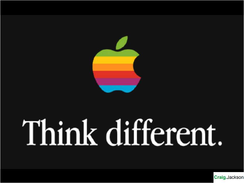
What slogan? Logo so effective we forget the slogans “Byte into an Apple" used in the late 1970s “Think Different” 1997–2002 ("think" is a verb, which is modified by adverbs; therefore the adverb "differently" should be used, not the adjective "different”) "iThink, therefore iMac" used in 1998 "Say hello to iPhone“ used in 2008

A few words about fonts . . . Motter Tektura Designed by Othmar Motter in 1975 Look familiar?

A few words about fonts . . . This text is standard Garamond 1984 onwards

Myriad and Podium Sans 2002 onwards Slimbach & Twombly for Adobe

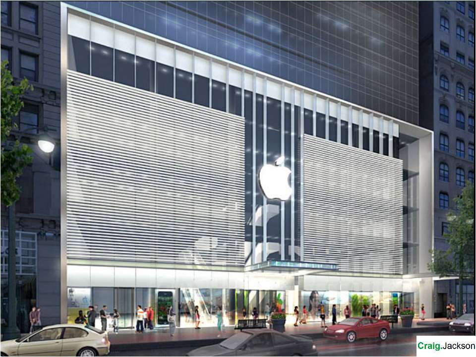
Litigation & Apple New York City

Litigation & Apple The Beatles and Apple Corp

It’s not a shop Clinical Beyond retail Religiosity Cult Temple Cubism Zen Contemplative Minimal Alters

Birmingham Anne Summers?
Схожі презентації


Категорії